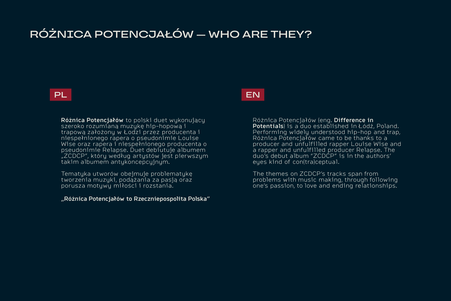
Różnica Potencjałów
End-to-end branding and art direction for a music duo, created in partnership with the artists from the earliest stages of the band’s formation. A visual language that translates the band's sonic identity into a cohesive and scalable brand system.
About
The visual identity and branding for Różnica Potencjałów was an exciting project, where I was responsible for creating the band's identity at the conception of this artistic endeavour. Collaborating closely with the artists themselves, cinematographers, video editors and other creatives involved in the process of shooting music videos, this project was an exciting opportunity to translate the underground, uniquely Polish feel RP represents.
Branding
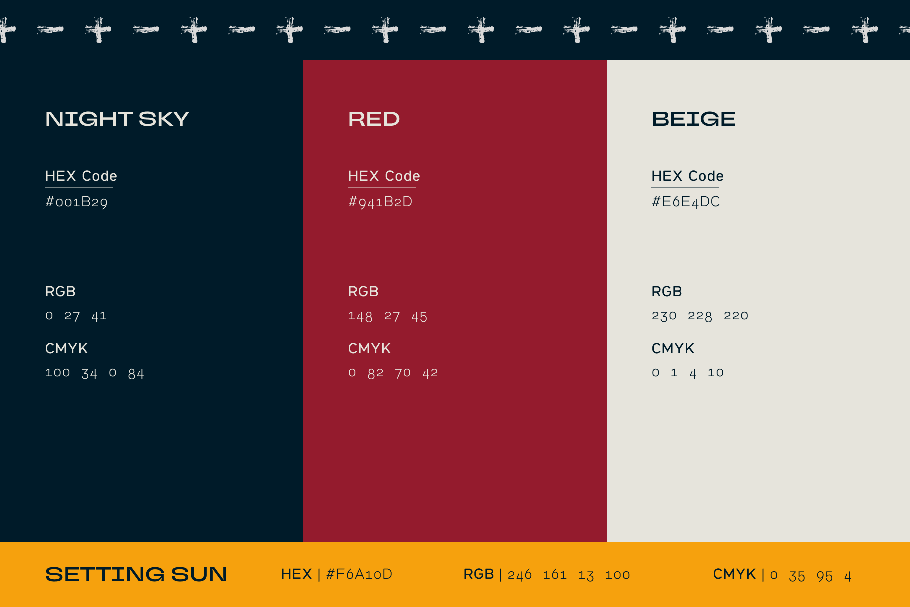
RP's identity spans from 2D visuals, brand tone, personality, to textures and colour schemes present across media and platforms. The underground, rebellious feeling RP conveys through their sounds was prioritised at every touchpoint while keeping a modern touch through typography.
Identity
The identity defines RP’s core visual foundation through logo design, typography, and a restrained colour system. Drawing from underground aesthetics and raw materiality, the mark and typographic choices establish a bold yet minimal framework designed for clarity and longevity.
Logo
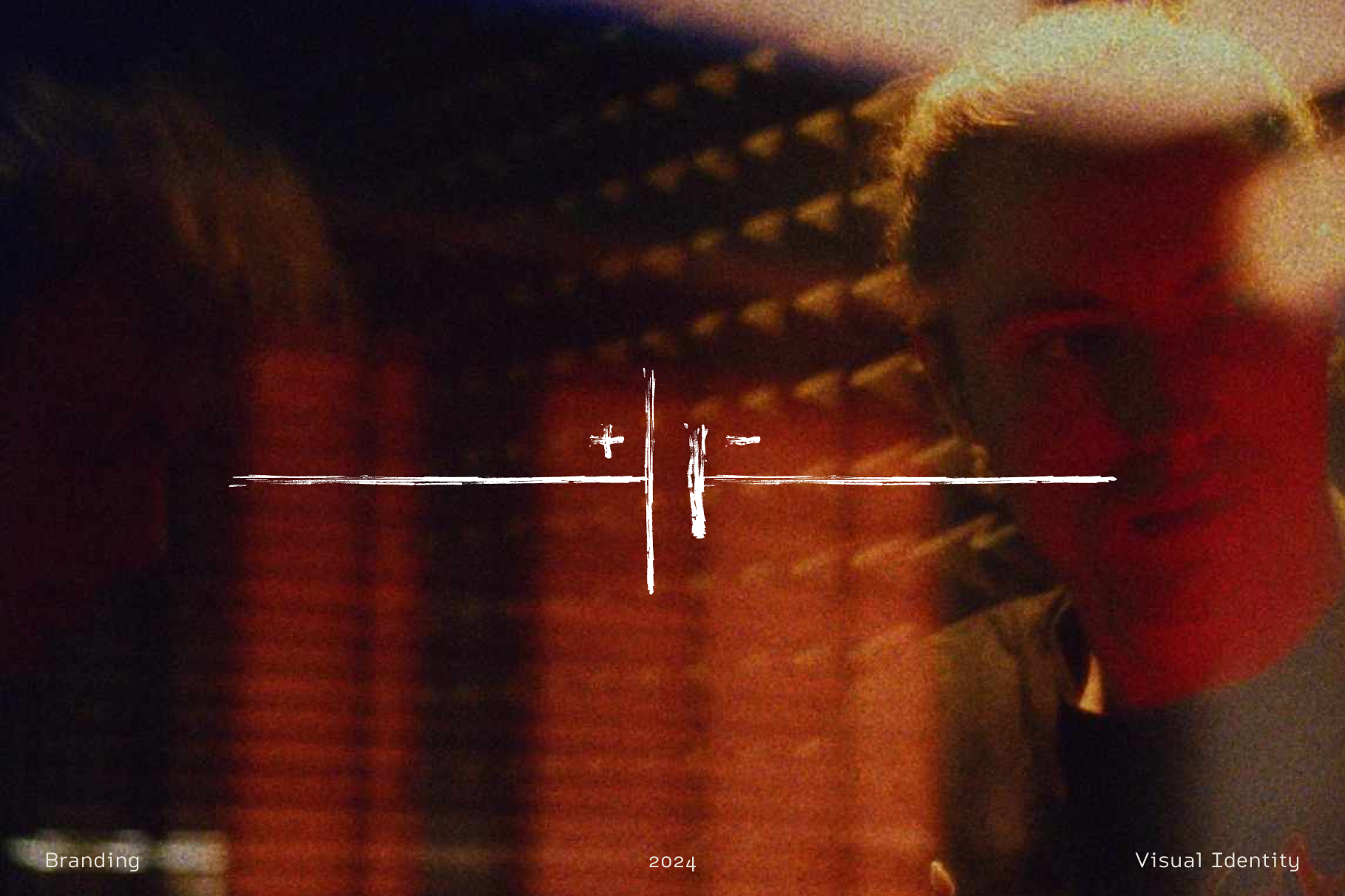
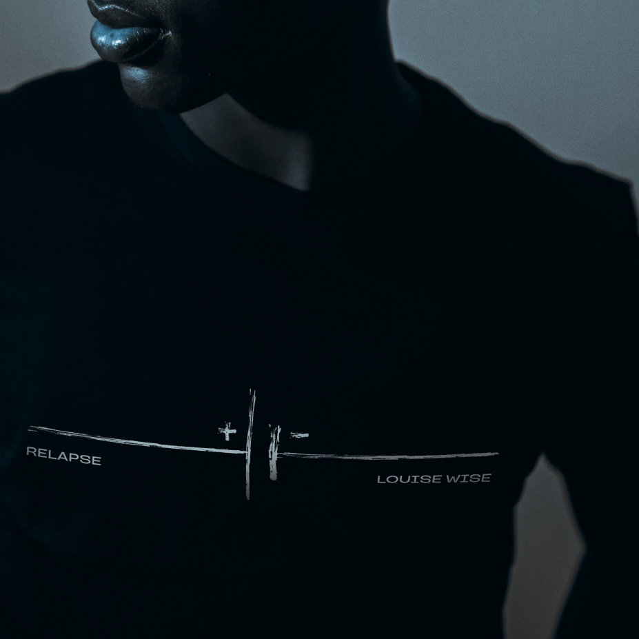
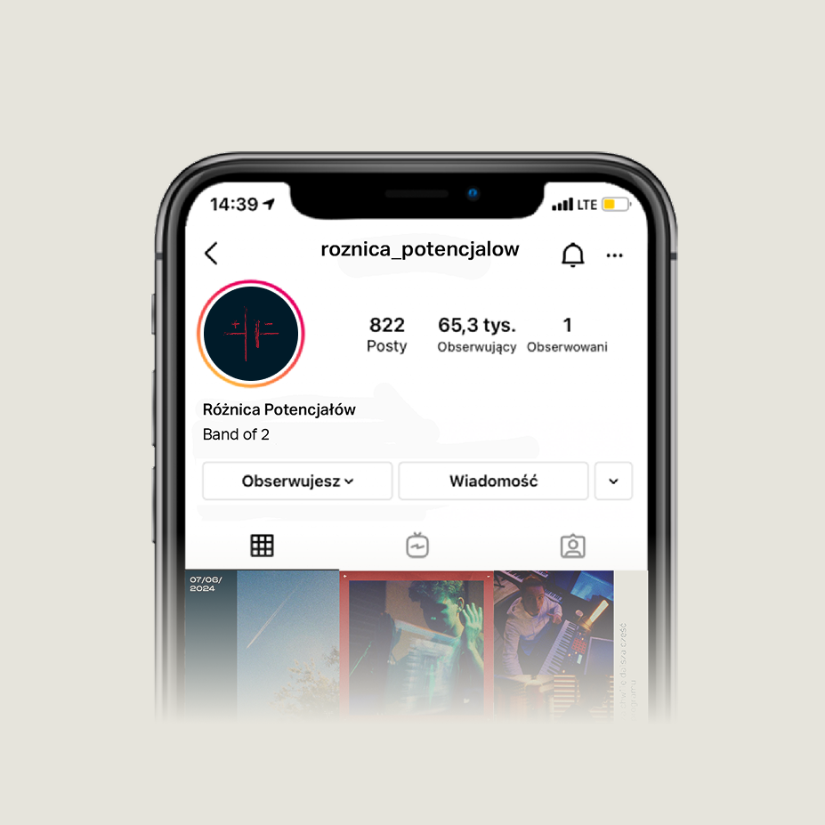
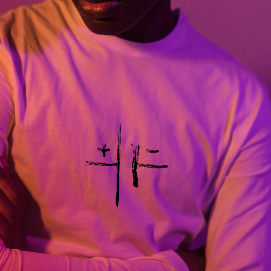
Built around the raw "underground" aesthetic of Polish basements, the mark prioritises immediacy an adaptability. Designed to feel as if it could be scribbled on a wall in seconds, the form is stripped back to its most essential strokes while remaining unmistakably tied to the band’s name. The logo's restrained construction ensures clarity across digital and print applications, with the stylised linework anchoring the broader identity system.

Promotion
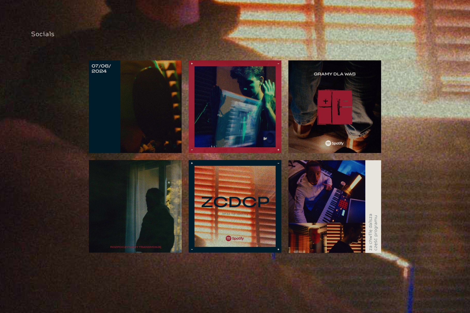
The visual system extends into promotional materials including digital campaigns, cover releases, and merchandise. Each execution reinforces the brand’s recognisable aesthetic while adapting to context and format.
Check out RP's music: