VIRO
Brand direction and logo for an Australian platform focused on the origination, development, investment, build out and operation of energy storage assets in Asia and Australia.
About
The focus of this project was positioning the client on the market and differentiating them from competitors while maintaining their energy-agnostic approach to conducting business.
Logo
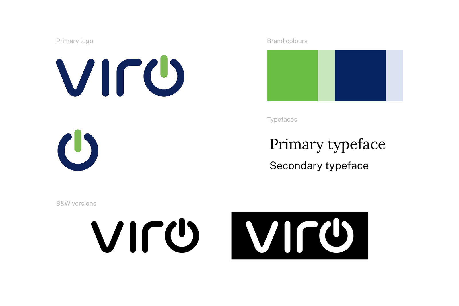
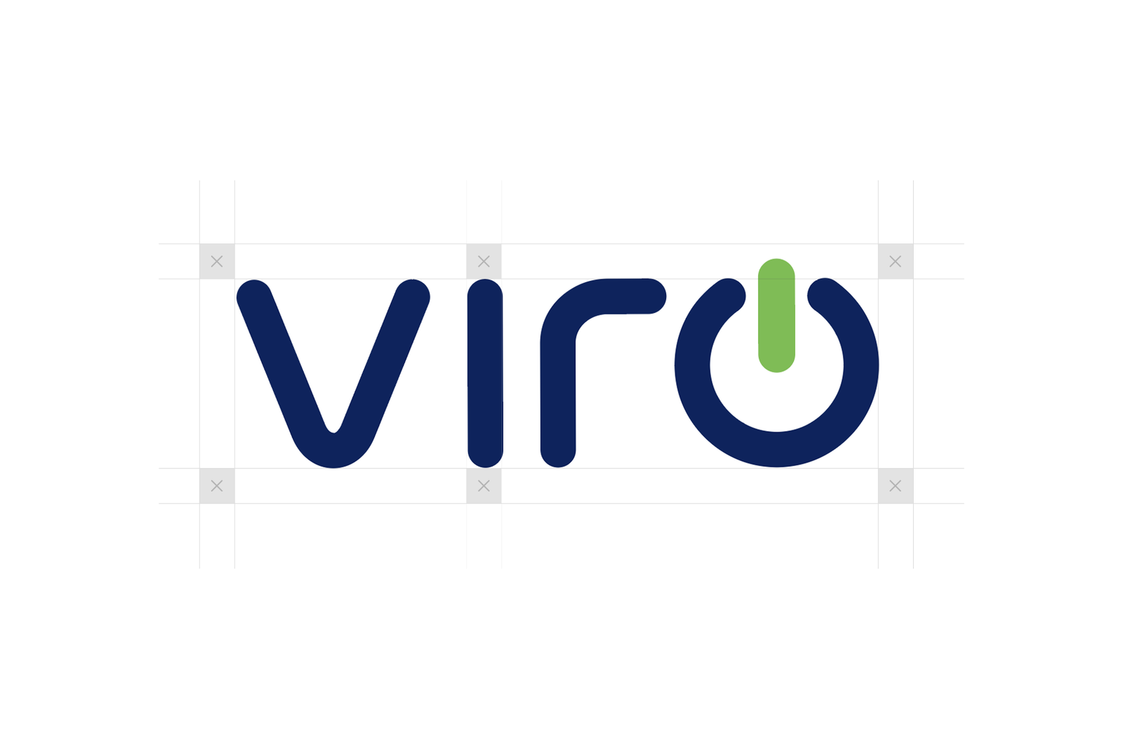
Since this is an ongoing client collaboration, the most important asset to start the brand with was the logo. The VIRO logo combines the brand name with an easily-identifiable power button symbol for versatility across use cases. For the logo forms, the focus was put on simplicity, and symbolism that alluded to energy without tying it to any specific type of energy.
Brand Colours
The light green colour reflects the warm and approachable aspects of the brand, and bring renewable energy sources to mind. The deep navy blue compiments the simple shapes of the letters communicating trust and reliability valued in the energy and corporate sectors.