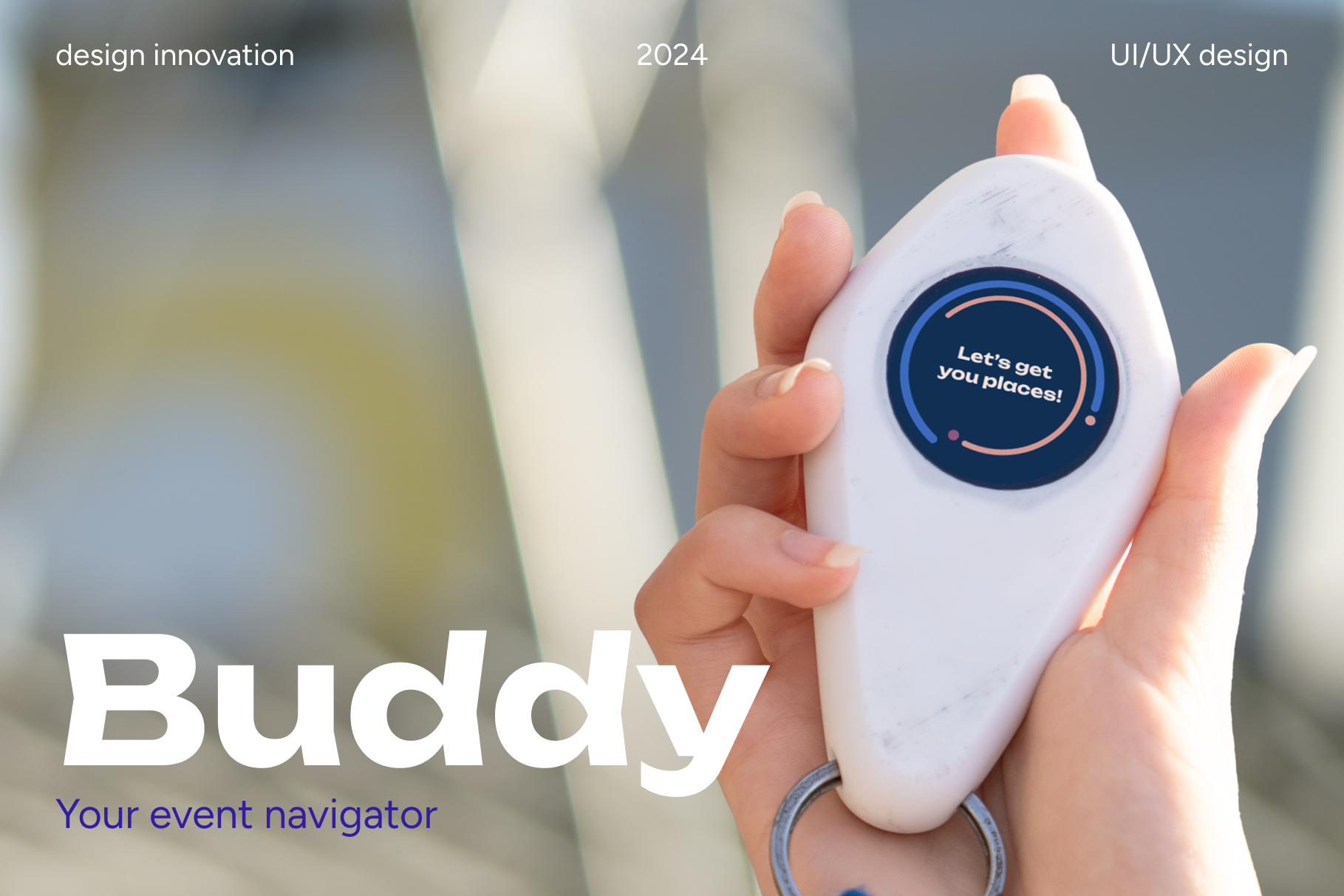
Buddy
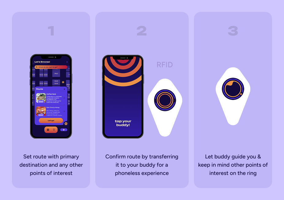
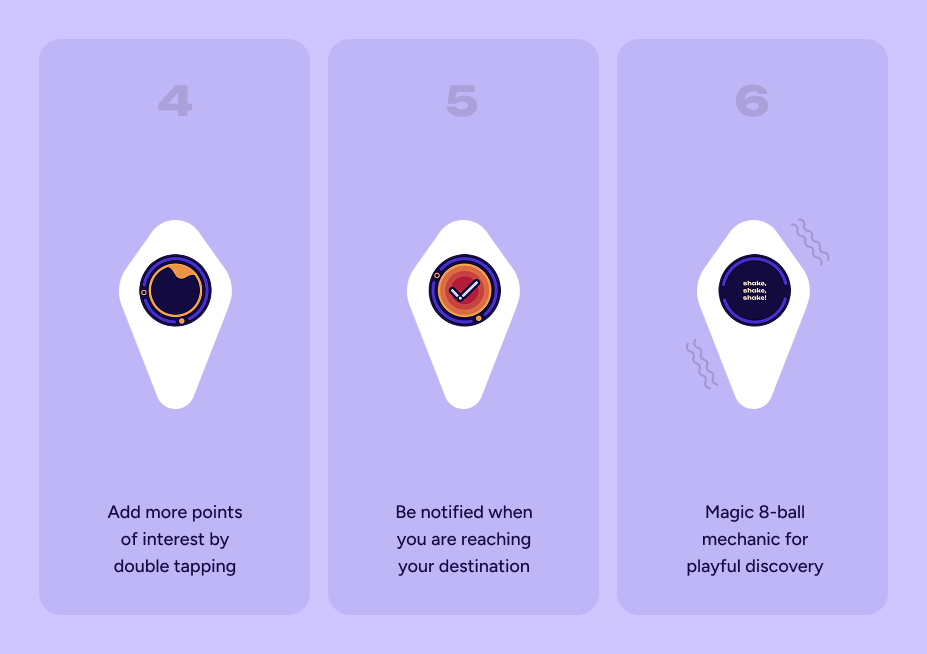
Product concept aimed at expo halls and events without a fixed stall layout to aid with visitor navigation.
About
Buddy is a product & service design concept developed
for my Master's degree course Innovation by Design. This device helps people
visiting expo exhibitions navigate an unfamiliar, chaotic space and find desired vendros and stalls with ease.
For this project our team developed both a technically functioning prototype as well as
a physical, visual proof of concept.
In this team collaboration, I actively participated
in all phases of the design process and was in charge of developing the user interface for
our device as well as branding the product.
Design thinking
Problem statement
While attending one-time, stall-based events attendees often struggle to find their way around the unfamiliar venues. This causes frustration, unnecessary crowding and decreases the user experience quality.
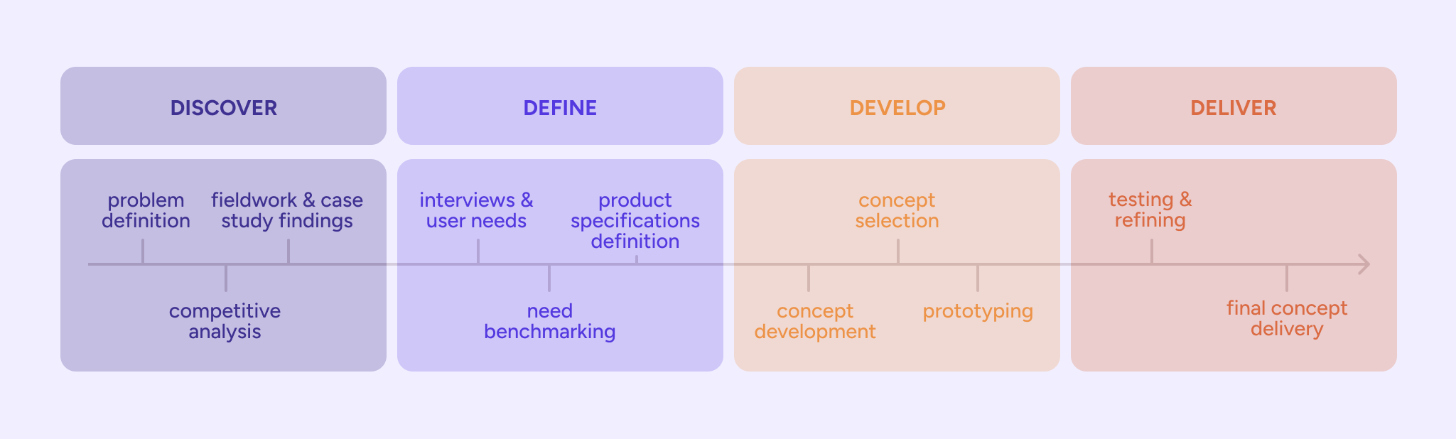
The four phases of the Double Diamond framework that provided the foundation for our team's work.
Design process
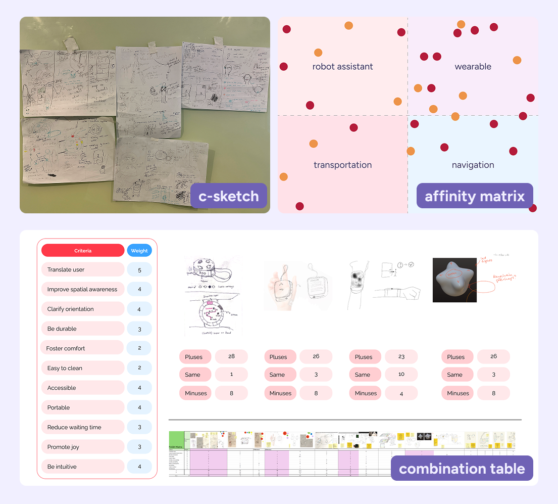
Throughout the 4 phases of the Double Diamond framework our team completed a number of design thinking methods to arrive at our final concept. These steps were vital for the success of our solution and allowed for creativity, iteration, and readjusting our goal without creating setbacks in our development timeline.
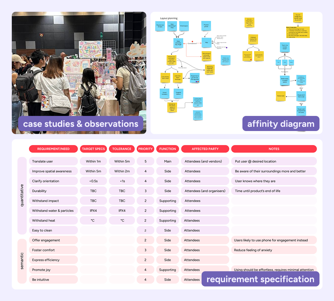
UX reserach
Our research showed that users value personalised navigation that can be brought up in an instant, but that only serves as a supporter to the visit rather than occupying their time and attention. Applying Nielsen’s heuristics we prioritised user control, clear system status cues, and a utilitarian approach to what’s shown on the visitor’s buddy.
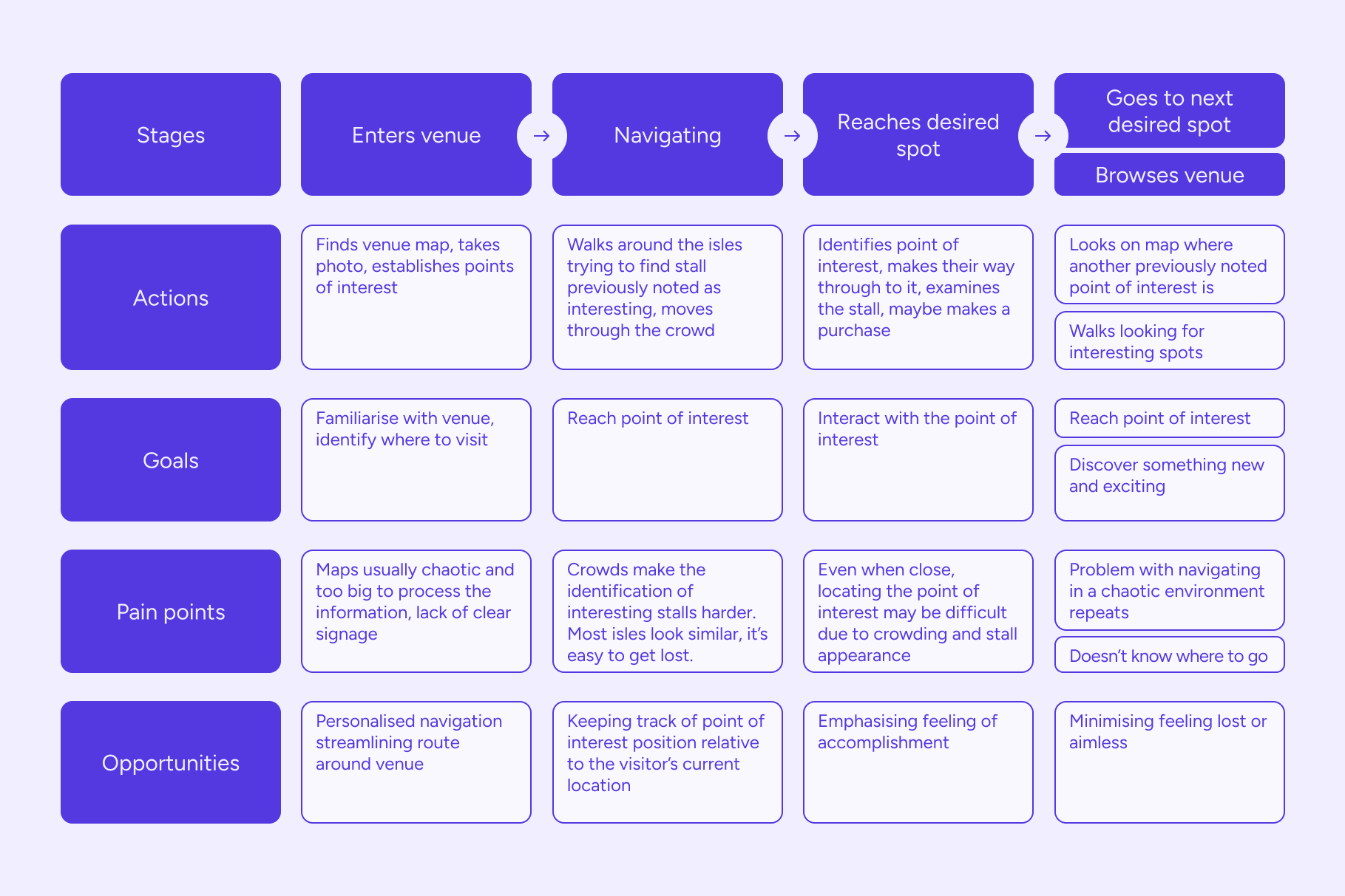
User journey map developed to identify product development opportunities within the setting of visitng a one-time, stall-based event.
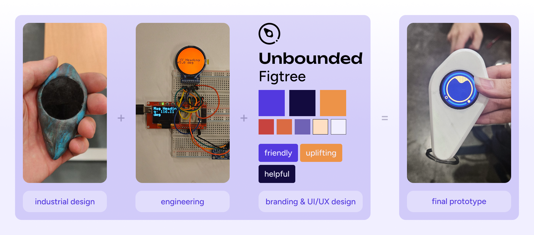
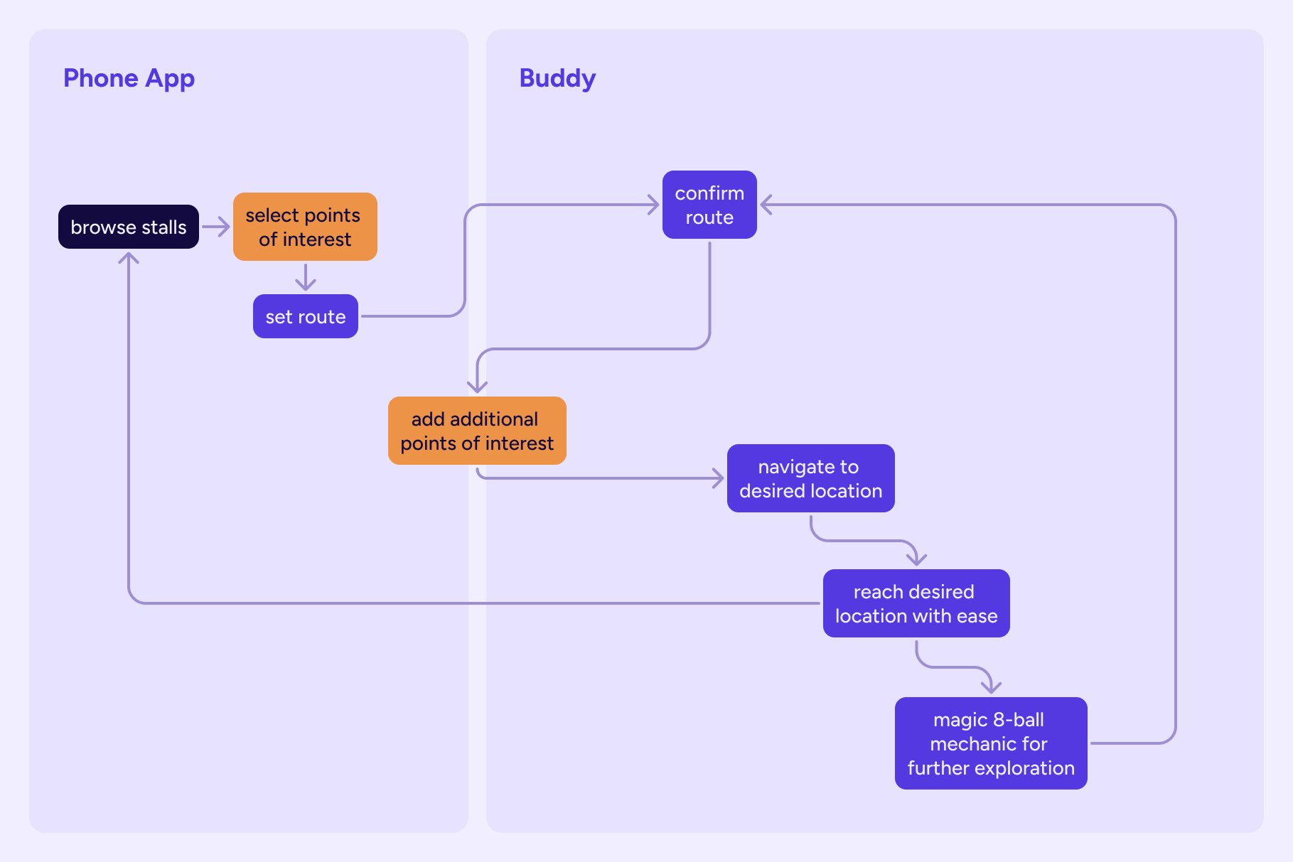
UI x product development
An imperative aspect of this project was cooperating across different areas of expertise. As a person in charge of UI development and a side of branding for our final product, collaborating with product design and engineering requirements and constraints was important, while still uplifting the ease of interaction for the user.
Buttons were considered, but not developed for the prototype since their inclusion required additional engineering efforts which was not a priority for the MVP function and look.
Translating UX findings into UI system
In order to successfully carry over findings from user research, when developing the interface I identified key states necessary for Buddy’s user flow and assigned clear design aliases to the primitive colours within the system to the key necessary states for our MVP showcase.
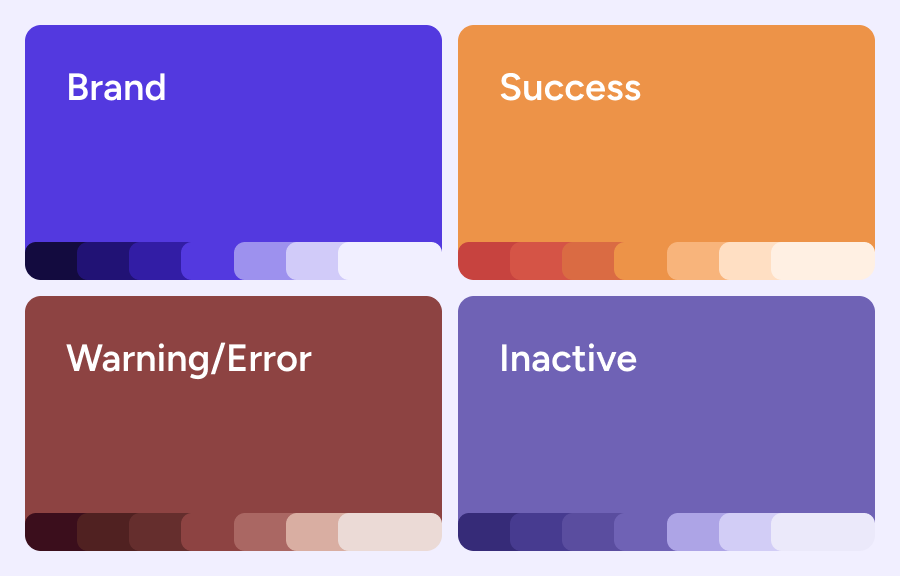
Primitive colours organised into alias collections.
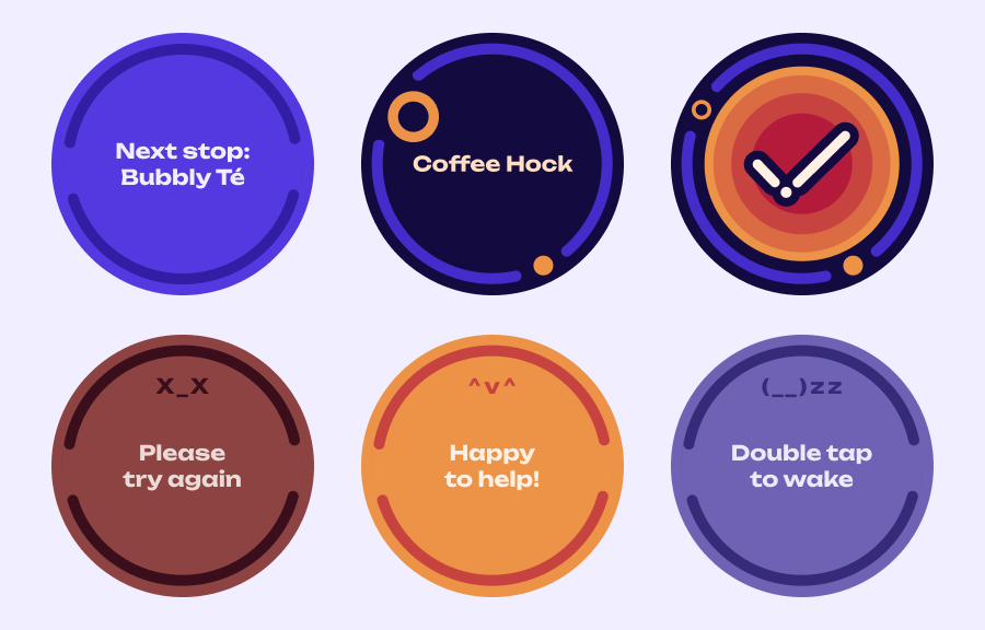
Interaction design for innovation
With a product with very specific interactions outlined, it was key to assign intuitive ways to operate the device while maintaining it within the design affordance norms. As the main action did not require device input from the user, the interaction focus was on intuitiveness and priority of functions.