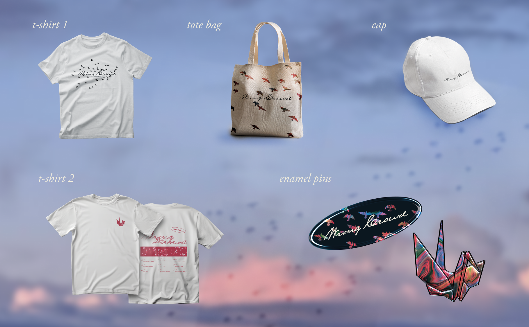
Wrong Crowd
Tom Odell’s second studio album redesign inspired by topics of changing emotions, hope, and going through life’s ups and downs present on the tracks.
About
The Wrong Crowd is an album very dear to me. It expresses a wide range of emotions while centering its main themes around personal identity, and the importance of memories. The music videos accompanying 7 out of 15 songs on the album support this vision by telling a non-linear narrative of one person’s experiences in a very dream-like manner. I decided to translate my passion for this album’s music towards a rebrand of the album’s visual identity which in my eyes always fell a bit short next to the rest of the art that makes this album so great.
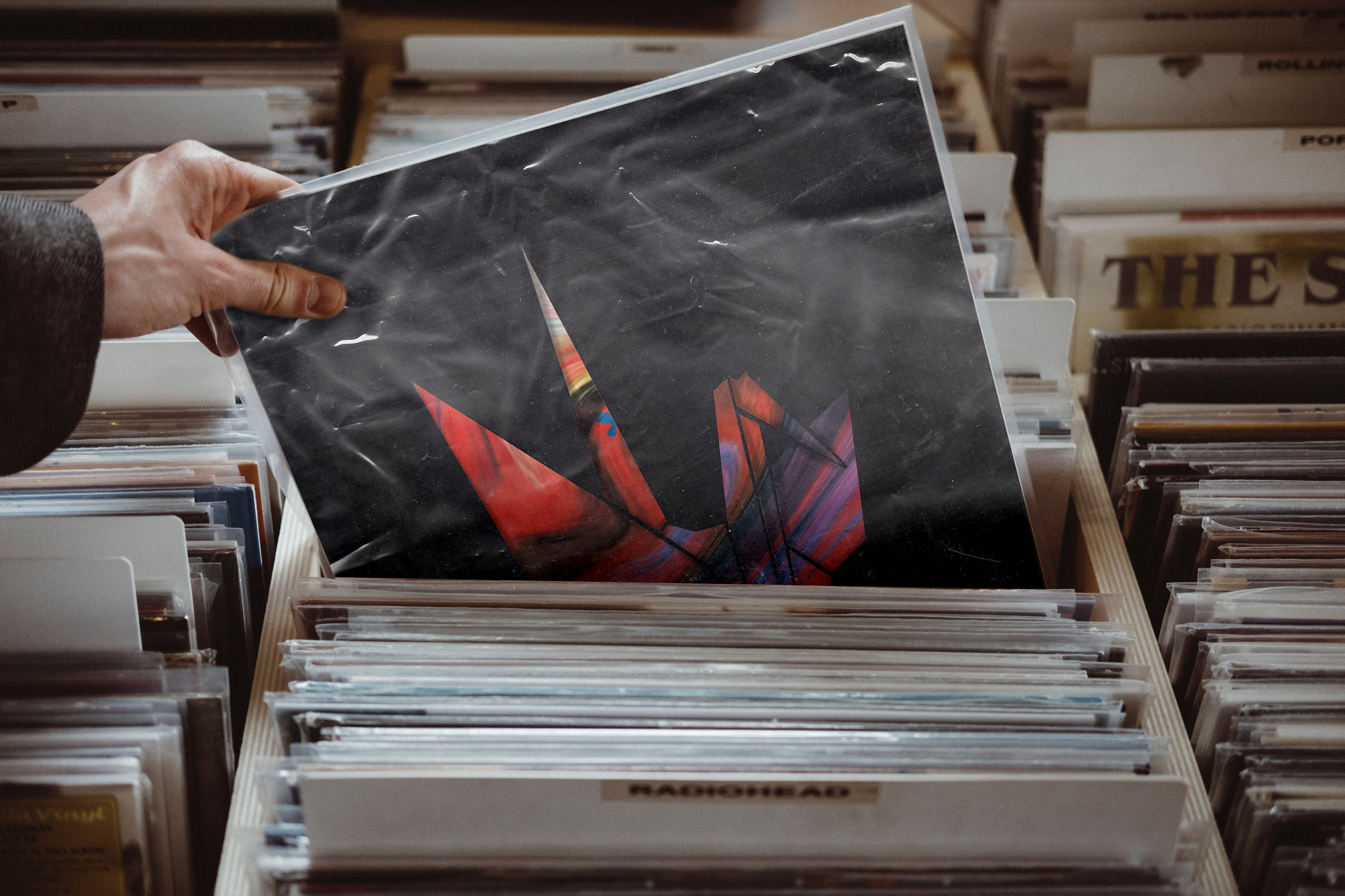
Original design
The original design of the vinyl felt very disconnected. The front cover has a strange texture on it, and does not connect to the rest of the identity at all. While the central panel is directly tied to the music videos of the album, the design of the album’s outside could use some more attention in its development. By redesigning this album, I aimed to build upon the artistic vision of this album, not reinvent it from scratch.
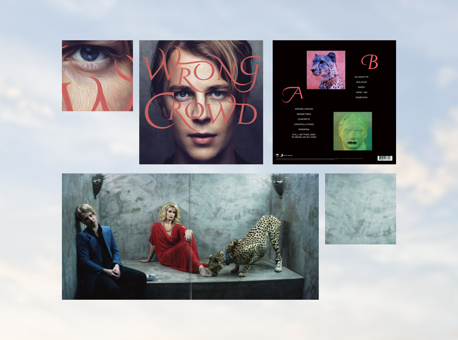
Front, back and centre of the original vinyl design released in 2016.
Redesign
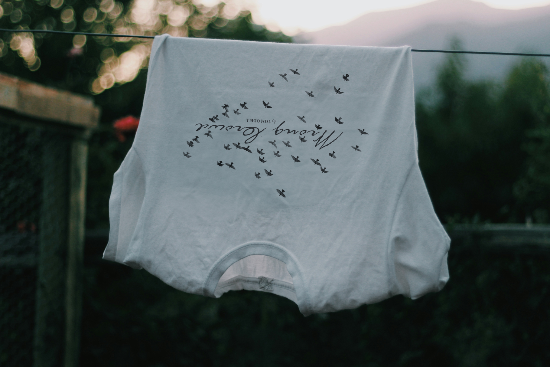
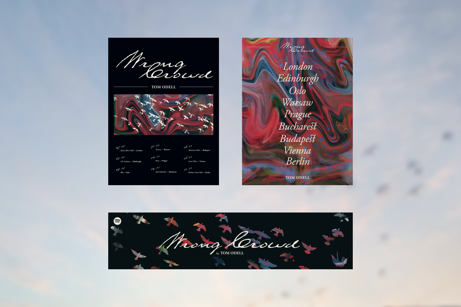
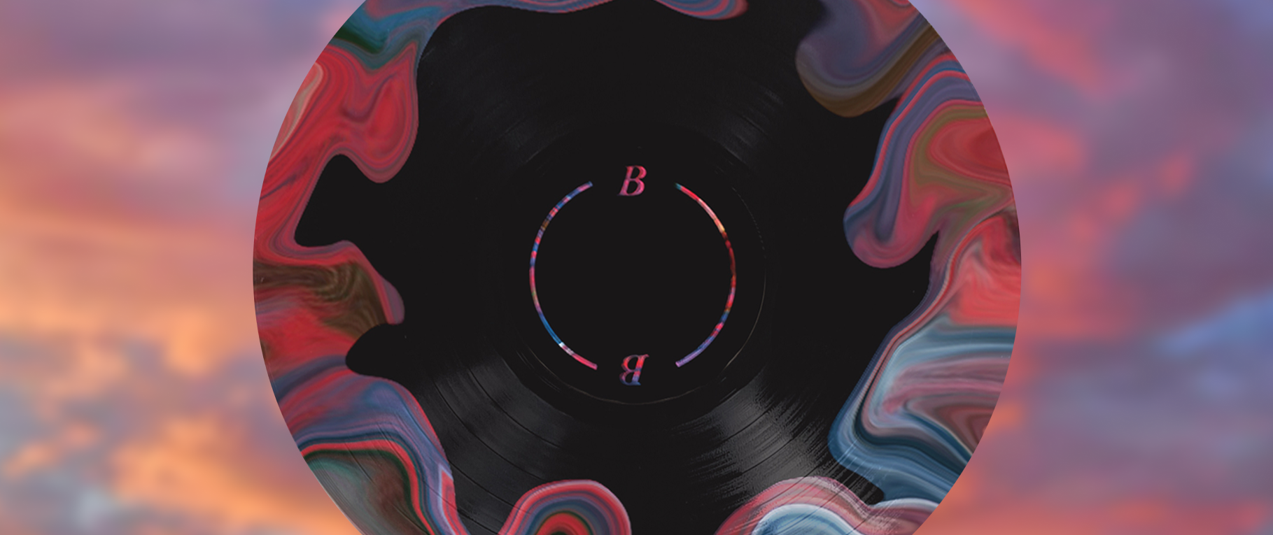
In the interviews promoting the album Odell talked about his artistic interpretation of the tracks. In a lot of interviews the themes of memories and a non-linear narrative were mentioned which striked my interest. In the visual system for this project I focused on imagery related to layers and intertwining and openwork, inspired by Tom Odell's vision. To contrast the organic visuals, I incorporated a silhouette of a paper crane. With its rigid lines and fragile construction it represents memories that can be as easily skewed and altered.
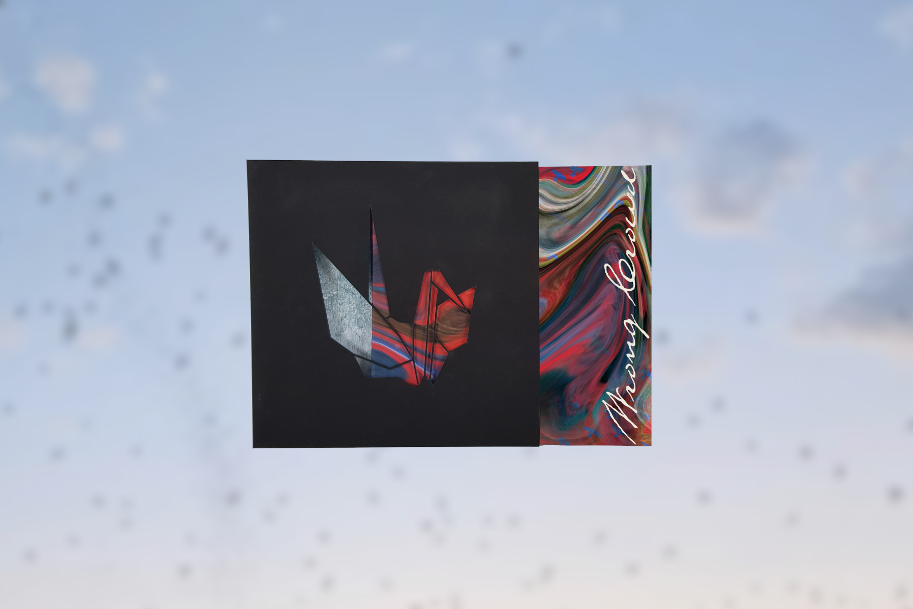
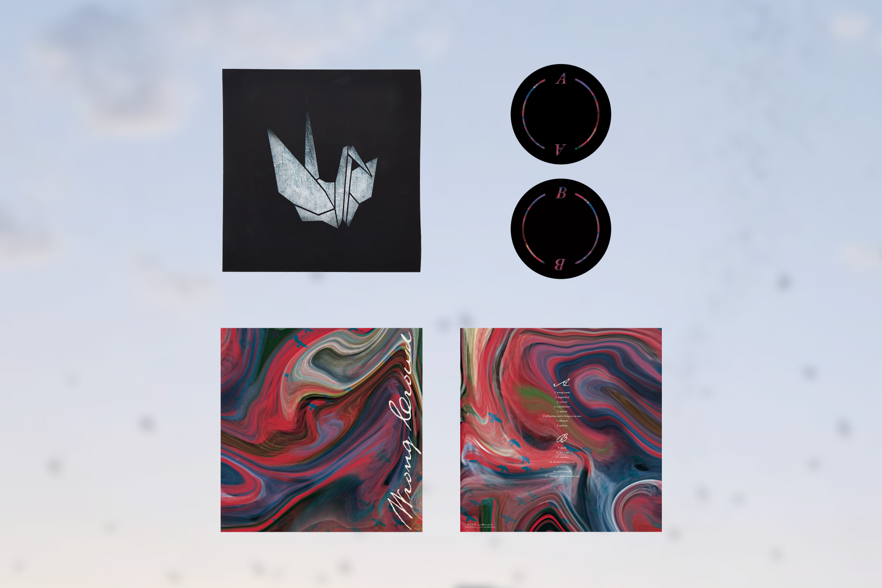
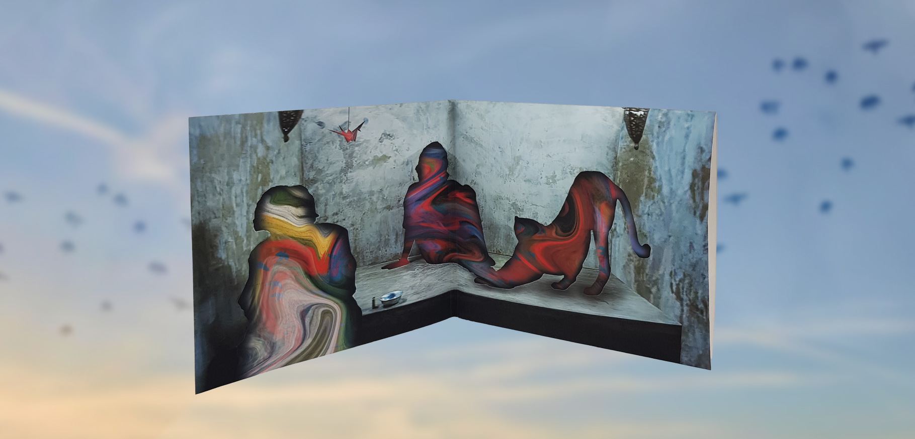
The inside of the album is the iteration of the original design — the photo is a shot from one of the music videos, and keeping it while adding the dreamy element of the simulated openwork tied the experience of opening the album and feeling like the layers are intertwined.